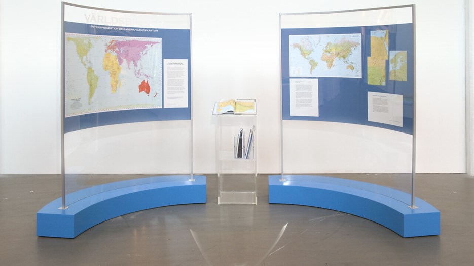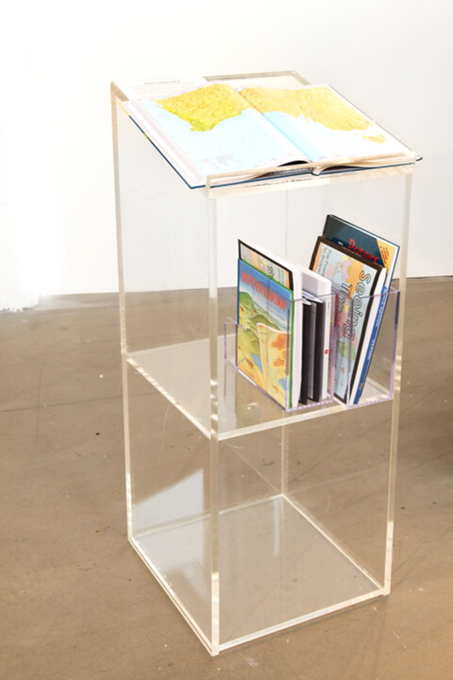
From the exhibition Peter's Projection at Bildmuseet.

From the exhibition Peter's Projection at Bildmuseet.
A map of the world is an abstraction. The Earth is a sphere, and a sphere cannot be rendered accurately on a two-dimensional surface. For thousands of years, cartographers have wrestled with the question of how to depict our planet on a map. Peters Projection is an exhibition about maps and our view of the world.
It may not sound like a particularly problematic story: The quest for better, more accurate projections of the globe. However, world maps are not just more or less accurate projections, or technically mathematical solutions for projecting the Earth. They also have philosophical, ideological and political implications. There are no ‘natural’ world maps.
The Western mapping tradition is based on the influential world map published by Flemish geographer Gerardus Mercator in 1569. This cylindrical projection has dominated the cartographic tradition ever since. To this day, our view of the Earth is heavily influenced by Mercator’s map.
Arno Peters, a German cartographer, challenged this tradition in 1974. He noted that traditional cylindrical world maps enlarge the parts of the world near the poles, making countries and continents at the equator appear comparatively smaller than they actually are.
Peters’ world map takes a different approach. It is the first map projection in history that consistently maintains full proportionality across the globe. The actual surface area of each country and continent is represented in accurate proportions. Peters’ map is also the first to depict precise north-south and west-east relationships across the globe.
We are so accustomed to the Mercator tradition that Peters’ map is shocking at first glance. Does the Earth really look like that? Is Africa so big, and Europe so small? Are Brazil and India so huge, and Greenland and Germany so relatively small? And is the island of Madagascar really twice the size of England?